주식차트 그리기
가상화페 거래소에는 주식 거래소와 마찬가지로 캔들차트를 볼 수 있다. 거래량도 볼 수 있고 거의 모든 보조지표들을 표시할 수 있다. 파이썬 프로그래밍을 통해서 직접 이 차트를 그려보도록 하자.
준비물
-
파이썬
기본적으로 사용할 언어 -
jupyter lab 환경
jupyter notebook 환경과 동일한 결과를 볼 수 있다. -
cryptowatch API
실시간 주가 데이터를 받아올 시세 사이트의 API
cryptowatch
cryptowatch API
Getting Started
Our REST API provides real-time market data for thousands of markets on 23 exchanges. You can use it to fetch last price, 24 hour market statistics, recent trades, order books, and candlestick data.
docs.cryptowat.ch
크립토워치 - 실시간 비트코인 가격 차트
분석 계속 크립토워치에 추가되고 있는 가격, 거래량, 주문 흐름 등의 대한 데이터 시각화 기능 라이브러리를 이용하여 암호화폐 시장을 분석하세요. 원하는 색상을 적용하고 지표도 설정해서 활용하세요.
cryptowat.ch
-
bokeh
차트를 그려줄 파이썬 라이브러리. pip 가 있다면pip install bokeh
를 통해 설치가능하다.
등이 필요하다.
캔들차트 그리기
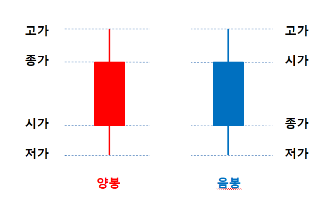
우선 주가데이터를 가지고 캔들차트를 그려본다. 가장 기본이되는 데이터이기 때문이다. 캔들차트를 그리려면 시가, 종가, 저가, 고가 를 의미하는 OHLC 데이터가 필요하다. 혹시 캔들차트를 모르는 사람을 위해 이미지를 첨부한다.
cryptowatch API 를 이용하면 OHLC 를 받을 수 있다. 그리고 시간대별로 캔들을 그려넣을 수 있다.
코드를 보며 하나하나 따라하면 어렵지 않을것이다.
시세 사이트에서 데이터 가져오기
import requests
import datetime

# 가져올 데이터의 기간을 정함.
start = datetime.datetime(2020,2,10,2,1,21)
# end = datetime.datetime(2020,2,15,2,1,21)

# bitfinex 거래소의 비트코인 가격 데이터(미 달러 기준)
URL = 'https://api.cryptowat.ch/markets/bitfinex/btcusd/ohlc'
# 3600 초 = 1 시간 단위 봉
params = {'after':start, 'periods':'3600'}
response = requests.get(URL, params=params)
response = response.json()

print(response['result']['3600'][0])
[1581271200,
 10092.11686556,
 10104,
 10078,
 10085,
 119.37180621,
 1205002.0136901417]
위 코드는 시세사이트에서 거래소, 코인, 기간 등을 지정해서 데이터를 가져와 response 라는 변수에 저장한다.
그러면 매우많은 데이터가 저장되는데, 그 중 첫번째 데이터를 출력하면 위 리스트처럼 나온다. 7 개의 데이터가 있는데 순서대로 시간, 시가, 고가, 저가, 종가, 비트거래량, 달러로 환산한 거래량 이다. 캔들차트를 그리려면 OHLC 만 있으면 된다.
시간표시가 이상한데, unix timestamp 라고 컴퓨터가 이해하는 초 단위 시간이라고 생각하면 된다. 나중에 사람이 알아볼 수 있는 시간으로 변환하면 된다.
데이터 변환하기
data = response['result']['3600']
df = pd.DataFrame(data, columns=['date', 'open', 'high', 'low', 'close', 'volume', 'quote_volume'])
df.loc[:, 'date'] = pd.to_datetime(df.loc[:, 'date'], unit='s')
주가 데이터는 데이터프레임 형태로 다루는게 편하다. 모든 데이터를 하나의 데이터프레임에 넣는다.
마지막 줄은 시간단위를 변환하기 위한 것이다.
차트 띄우기
from bokeh.plotting import figure, show, output_notebook
from bokeh.layouts import gridplot
from bokeh.models.formatters import NumeralTickFormatter

output_notebook()
inc = df.close >= df.open
dec = df.open > df.close

# 캔들 만들기
p_candlechart = figure(plot_width=1050, plot_height=300, x_range=(-1, len(df)), tools=['xpan, crosshair, xwheel_zoom, reset, hover, box_select, save'])
p_candlechart.segment(df.index[inc], df.high[inc], df.index[inc], df.low[inc], color="green")
p_candlechart.segment(df.index[dec], df.high[dec], df.index[dec], df.low[dec], color="red")
p_candlechart.vbar(df.index[inc], 0.5, df.open[inc], df.close[inc], fill_color="green", line_color="green")
p_candlechart.vbar(df.index[dec], 0.5, df.open[dec], df.close[dec], fill_color="red", line_color="red")

# 날짜 표시를 위한 작업
major_label = {
    i: date.strftime('%Y-%m-%d') for i, date in enumerate(pd.to_datetime(df["date"]))
}
major_label.update({len(df): ''})
p_candlechart.xaxis.major_label_overrides = major_label
p_candlechart.yaxis[0].formatter = NumeralTickFormatter(format='0,0')

# 그리기
p = gridplot([[p_candlechart]])
show(p)
위 코드는 캔들을 만들고 그리게 된다. 종가가 시가보다 높으면 양봉, 낮으면 음봉이다. 서양권에서는 양봉을 초록색, 음봉을 빨간색으로 채운다. 우리나라는 양봉을 빨간색, 음봉을 파란색으로 그러니까 헷갈리지 않도록 주의한다.
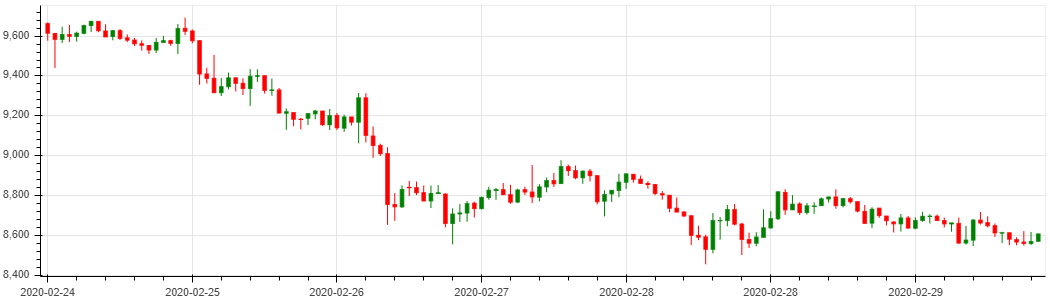
최종적으로 아래와 같은 차트가 jupyter 내에 뜬다.
'주식 , 가상화폐 > 기술적 분석' 카테고리의 다른 글
| python 으로 비트코인 분석용 차트 그리기 | 거래량 그리기 (0) | 2020.03.07 |
|---|

댓글